Peterson Simon Logo - A Red and yellow logo with a mix of P and S Mashed together.

Portfolio

Step into a world where strategic design and creative brilliance converge. This portfolio presents a dynamic collection of graphic and web design projects, each crafted with the precision of a well-executed chess move. The print work demonstrates versatility and attention to detail, seamlessly transforming digital concepts into physical masterpieces. Meanwhile, the photography and video editing capture moments with a sharp eye for composition, creating stories that resonate and inspire. Every piece here is a deliberate move in the art of visual storytelling, blending strategy with an unwavering commitment to excellence.

Thumbnail Designs

Small in size, but powerful in impact. Thumbnails in this portfolio are designed to captivate at a glance, distilling complex visuals into concise, attention-grabbing icons. Each thumbnail serves as a gateway, strategically crafted to draw viewers in with bold composition, vibrant colors, and a clear representation of the content within. These mini masterpieces are precision tools in the art of first impressions.

Social Media Post Designs

Where strategy meets social engagement. Every social media post in this collection is carefully crafted to stop the scroll and spark conversation. With a keen sense for platform-specific trends and audience dynamics, these posts balance visual appeal with succinct messaging. From bold graphics to thoughtful layouts, each design is a calculated move to elevate brand presence, ensuring maximum visibility, interaction, and impact in the digital sphere.

Click an image for details

Logo Designs

The essence of identity, distilled into design. The logos featured here are crafted with a deep understanding of brand personality and strategic vision. Each design is more than just an emblem—it’s a symbol of purpose, values, and distinction. With clean lines, memorable forms, and versatile execution, these logos are built to stand the test of time, representing the core of a brand’s visual identity with clarity and strength.

Click a logo for details

Flyer Designs

Tangible design with a lasting impression. These printed flyers are a blend of strategic layout and visual allure, designed to engage at first glance and resonate long after. Whether promoting events, products, or services, each flyer is carefully composed to balance aesthetics with information. Rich visuals, compelling typography, and thoughtful spacing ensure that these pieces not only inform but also leave a lasting mark, transforming digital creativity into physical, impactful communication.

Click an image for details

Video Editing

Visual storytelling in motion. The video work in this portfolio merges technical expertise with creative vision, transforming moments into compelling narratives. With a meticulous eye for pacing, composition, and sound, each video captures the essence of a message while keeping the audience engaged. Whether through sharp edits, smooth transitions, or dynamic animations, these videos are crafted to resonate deeply, conveying stories that inspire, inform, and captivate.

I also recorded all the videos showcased below.

© 2024 Peterson Simon

Square promotional poster for the 'Business Pitch Competition' on November 9, 2023, at 6 PM, held at Jackson North Medical Center, sponsored by Primary Medical Center, and Jackson Health System, organized by Scale Up 305 and Haitian American Chamber of Commerce. The poster has a clean and modern design with a light blue and red gradient background, featuring large, bold typography for the event title. It includes monochrome images of two individuals speaking into microphones, suggesting a live pitch environment. There is a classic microphone image at the forefront, symbolizing public speaking. Event details and RSVP information are clearly presented along with sponsor logos.

Scale Up 305 Business Pitch Flyer

This promotional poster is expertly designed to market the ‘Business Pitch Competition’ effectively while maintaining the branding of the Haitian American Chamber of Commerce and Scale Up 305. The use of a light blue background is not only visually soothing but also aligns with the corporate colors of the Chamber, reinforcing brand recognition. The monochrome images of individuals engaging with microphones invoke a sense of immediacy and participation, which is central to a pitch competition. The poster’s design is anchored by the use of bold and readable typefaces, with the event title in large letters that grab attention, and the strategic use of red to highlight the interactive aspect of the event – the ‘pitch.’ The inclusion of sponsor logos is handled with subtlety; they are present and noticeable without overpowering the event’s branding. Overall, the flyer is aesthetically pleasing, with a professional and modern look that effectively markets the event and upholds the branding consistency required by the Chamber and its partners. ‘PITCH’ with a red dot gives the design energy and focus. The inclusion of sponsor logos at the bottom provides a balanced endorsement, and the use of white space ensures legibility and visual appeal.

A vibrant square flyer with a bold graphic design for the 'AMA|NOLA International Collegiate Conference'. The design features a central silhouette of a plane zooming upwards against a backdrop of black and hot pink rays, creating a dynamic effect. Below the plane, the AMA logo is presented in pink, alongside the conference name. The flyer announces '28 SPOTS AVAILABLE' and invites viewers to 'Join Us, Apply Now'.

American Marketing Association at FIU - NOLA Conference Flyer 2017

The flyer’s design is striking and visually arresting, using contrast and color to great effect. The stark black and vivid pink create a sense of excitement and energy, which is ideal for marketing an event that targets collegiate attendees. The upward motion of the plane silhouette suggests progress, ambition, and forward-thinking—qualities that are often associated with academic conferences. The use of limited text ensures that the key messages are instantly clear, with the call to action ‘Join Us, Apply Now’ being both a directive and an invitation. The AMA logo is well integrated into the design, maintaining brand visibility and continuity. The design does well to market the event by conveying a sense of exclusivity and urgency with the ’28 SPOTS AVAILABLE’, prompting immediate action from the target audience. Overall, the flyer effectively balances strong visual engagement with clear messaging, staying true to the AMA’s branding while promoting the event’s unique character.

Elegant promotional flyer for the 2nd Annual Global Women Enrichment Conference featuring the keynote speaker, Kerry-Ann Royes, President/CEO of YWCA South Florida. The flyer showcases a centered professional headshot of Kerry-Ann Royes, with her name and title next to it. A lilac to purple gradient forms a circular frame around her, with event details below in purple and pink text, including the date, March 2, 2024, at 3:30 PM, and location at Graham Center Ballroom, Miami, FL. The flyer promotes live entertainment, dinner, and a grand prize giveaway, with a call to action to buy tickets online and a tagline 'BE EMPOWERED, ENCOURAGED, AND ENRICHED!' at the bottom

Kerry Ann Royes - 2nd Annual Global Women Enrichment Conference Promo

The flyer is a masterclass in understated elegance and is effectively designed to market the Global Women Enrichment Conference. The choice of a soft color palette conveys a sense of inclusivity and warmth, fitting for an event centered around women’s empowerment. The circular framing of the keynote speaker’s portrait draws the eye to her, emphasizing her importance to the event. The clear, sophisticated typography used for the event details ensures that the information is easily readable, while the hierarchy of the text guides the viewer through the key points effortlessly. The use of space and color maintains the branding of the conference, suggesting a professional and uplifting atmosphere. The design choices made here are likely to resonate well with the intended audience, encouraging attendance and emphasizing the event’s key message of empowerment.

Invitation flyer for a 'Meet and Greet' event on Tuesday, December 5, 2023, from 6 PM to 8 PM, featuring the new City of North Miami Police Chief Cherise G. Gause. The flyer has a winter theme with snowy palm trees set against a cityscape backdrop. Chief Gause is pictured in her police uniform, smiling. The flyer includes the Haitian American Chamber of Commerce logo, event details, and a QR code for RSVP. Text invites attendees to support a toy drive by bringing an unwrapped toy.

HACCOF Meet and Greet: December 2023

 This flyer employs a strong visual contrast between the tropical setting of Miami, represented by palm trees, and the winter-themed snowy overlay, creating an inviting and festive atmosphere for the event. The use of the police chief’s image in professional attire helps personalize the event, encouraging community engagement. The bold ‘MEET and GREET’ typography ensures that the event’s purpose is clear and immediately noticeable. The QR code is a modern touch that simplifies the RSVP process, reflecting a thoughtful consideration for convenience and technological trends. The overall design is cohesive and aligns with the Haitian American Chamber of Commerce’s branding through the use of their logo and color scheme, effectively marketing the event while maintaining the company’s professional image.

A square flyer with a gritty, textured black background that resembles asphalt. It features the AMA logo for Florida International University in pink at the top, followed by text in a street-sign-like font stating 'IS HEADING TO REGIONAL CONFERENCE USF (TAMPA)' within a shield outline. Below the shield, the dates 'NOVEMBER 4 & 5' and a reminder 'LAST DAY TO PAY' are clearly stated in bold, white letters.

American Marketing Assocation at FIU: Regional Conference Promo

This flyer is designed with a strong, urban aesthetic, using elements that mimic road signage and asphalt textures to create a sense of movement and destination, fitting for the announcement of a trip to a regional conference. The shield graphic that encompasses the ‘USF TAMPA’ text gives a nod to collegiate emblems, suggesting tradition and academia. The use of stark white and pink text against the dark background ensures high readability and visual impact. The design effectively markets the event by conveying a sense of urgency and excitement, while the clear typography communicates the essential information efficiently. The branding for the AMA at Florida International University is maintained through the use of the specific logo and color scheme, ensuring brand recognition and consistency.

The flyer announces the 7th Annual YoPro 20 Under 40 Awards Gala featuring the 2022 Honorary YoPro, Dr. Jeff Rocker. The design showcases a patriotic color scheme with red and blue elements against a white background. Dr. Rocker is depicted in a confident pose wearing a white lab coat with his name and 'CEO' title. Event details, including the date, location, and ticket information, are provided, along with a QR code for easy access.

HACCOF 7th Annual YoPro: Honorary YoPro Announcement

The flyer is designed to grab attention with its bold use of the Haitian flag’s colors, which, along with the Haitian American Chamber of Commerce of Florida’s logo, reinforces the organization’s identity. Dr. Jeff Rocker is prominently featured, lending a personal touch and enhancing the event’s prestige. The use of stars and clean lines gives the flyer a dynamic and celebratory feel, appropriate for an awards gala. The information is laid out in an organized manner, with clear calls to action, such as the date and venue details, and a QR code for ticket purchasing, ensuring the flyer is not only informative but also functional. The design effectively markets the event by highlighting the exclusivity and significance of the awards while maintaining the branding of the YoPro and the Haitian American Chamber of Commerce of Florida.

A promotional flyer for an AMA Happy Hour event at Miller's Ale House on Wednesday, Feb. 8 at 9:30 pm, following a general meeting. The flyer features a large, bold title with the venue's name over a background image of the ale house's interior. In the foreground, an illustrated plate of chicken wings adds a casual and inviting feel to the design. Event details are provided at the bottom, along with the AMA logo and social media handles for AMAFIU.

American Marketing Association at FIU: Happy Hour Promo

The flyer’s design is geared towards creating an informal and welcoming atmosphere, which is key for a social happy hour event. The use of a real image of the venue sets expectations and the illustrated food item adds a fun and approachable element. The AMA logo is integrated in a manner that maintains brand identity, while the vibrant color scheme is likely to catch the eye and draw attention. The layout is clean, with a good balance between image and text, ensuring the information is easily readable. This design effectively communicates the event details and creates a sense of community and engagement, essential for successful event marketing and maintaining brand consistency for AMAFIU

Promotional flyer for the 3rd Annual Sunday Brunch hosted by the Haitian American Chamber of Commerce, featuring a performance by Emeline Michel. The flyer has a vibrant orange and blue color scheme with an image of Emeline Michel dressed in orange with a matching head wrap. Event details are provided for the event on Sunday, December 10, 2023, at 11 AM at Level Three venue in Miami, with ticket and sponsorship information included.

HACCOF 3rd Annual Sunday Brunch: Performer Promo

The flyer is visually striking, with a high-contrast color palette that draws attention. The central image of Emeline Michel is sharp and engaging, effectively highlighting the cultural aspect of the event. The use of bold and script typography adds a dynamic and festive feel, suitable for the celebratory nature of the brunch. The design does well to market the event by focusing on the special guest performance, which can attract fans and those interested in cultural events. The clear and concise text provides all the necessary information without overcrowding the design, ensuring the message is accessible. The branding of the Haitian American Chamber of Commerce of Florida is present but does not overshadow the event’s main attraction, maintaining a balance between promoting the event and the chamber’s brand identity.

This image features a logo for a "Business Pitch Competition" in a horizontal format. The text "BUSINESS PITCH" is prominent in bold, blue uppercase letters, while the word "COMPETITION" is presented in a lighter blue and smaller font directly beneath. A microphone icon in red, which doubles as the letter "I" in "PITCH", is cleverly integrated into the design. The microphone cord forms a looping underline that underscores the word "COMPETITION", adding a dynamic and thematic touch to the overall design. The color scheme of blue and red adds a professional yet energetic feel to the logo.

HACCOF – Business Pitch

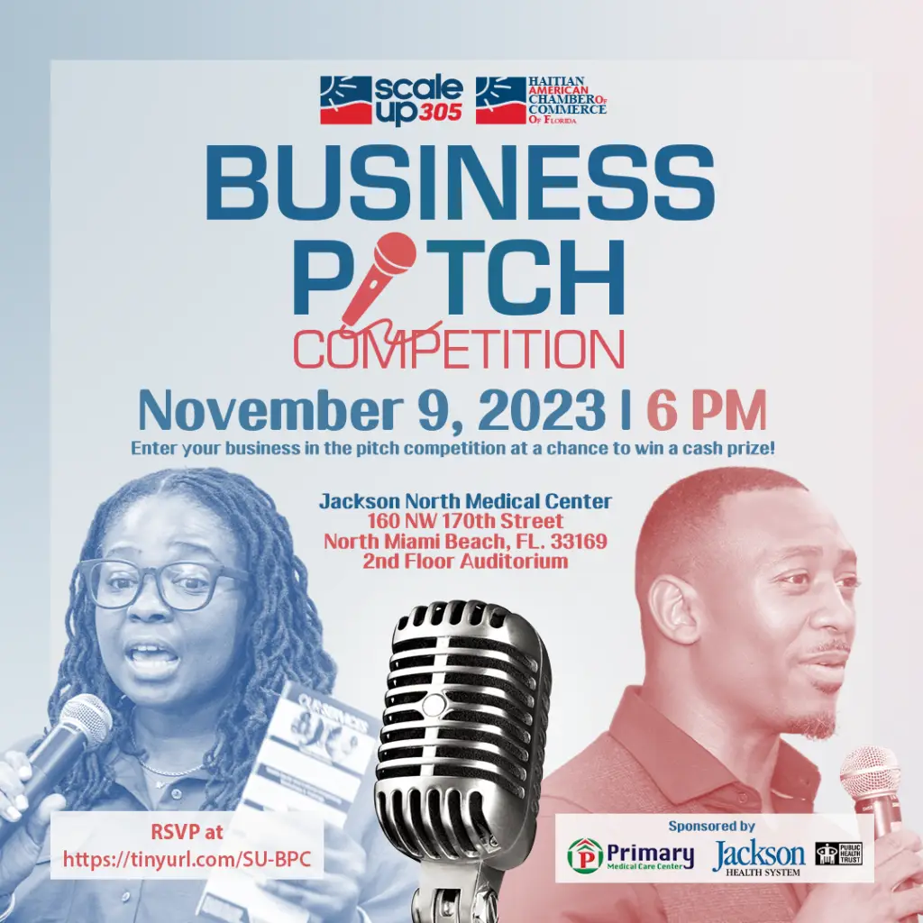
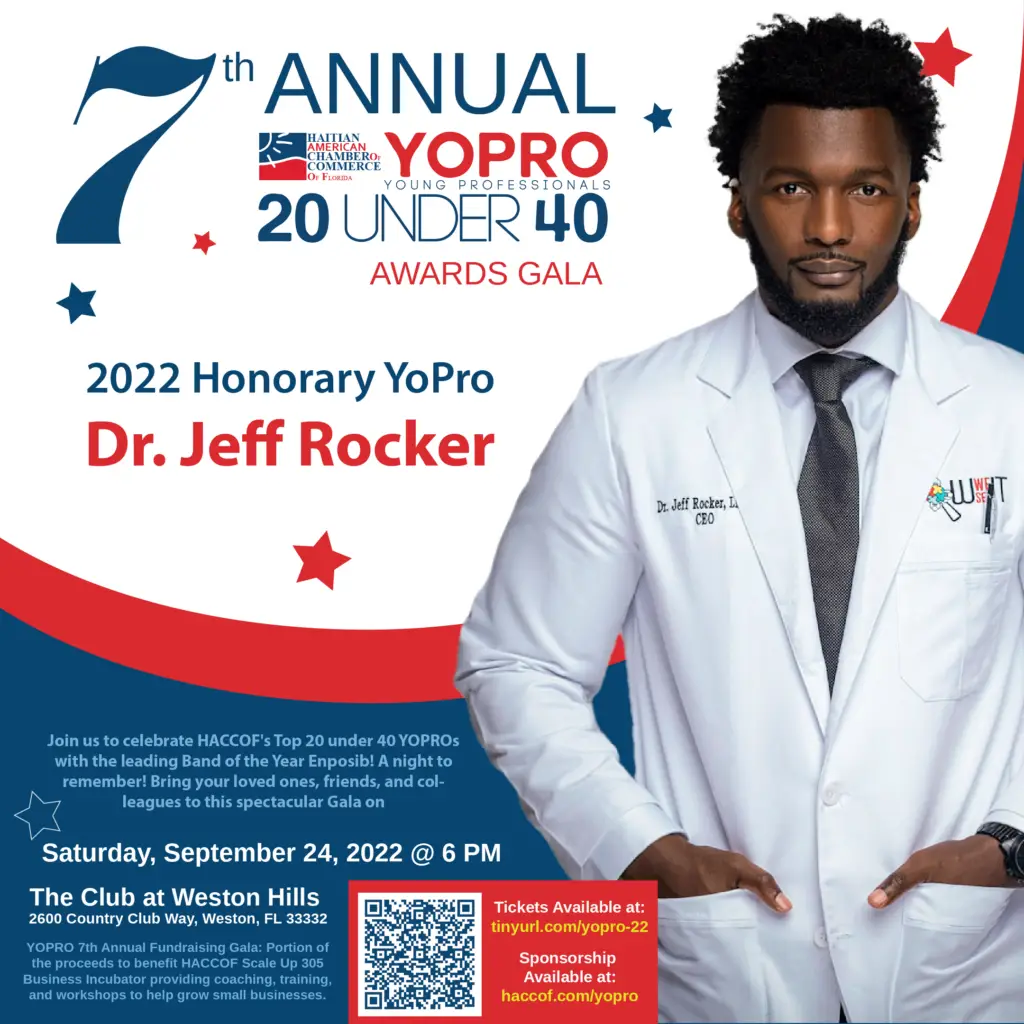
The image depicts a logo designed for a “Business Pitch Competition.” The use of bold, blue uppercase letters for “BUSINESS PITCH” paired with a smaller, lighter blue font for “COMPETITION” creates a strong visual hierarchy, making the purpose of the event immediately clear. The incorporation of a red microphone icon, creatively doubling as the letter “I” in “PITCH,” is both eye-catching and thematic, effectively symbolizing the event’s focus on vocal presentations and pitches. The microphone’s cord artistically loops under the word “COMPETITION,” adding a touch of style and emphasizing the event’s dynamic nature.

Logo for "Breakfast & Learn with HACCOF," featuring stylized text and a steaming cup of coffee. The text is in vibrant yellow and blue colors, and the coffee cup is illustrated in yellow with blue steam, emphasizing a morning theme.

HACCOF – Breakfast and Learn

The color scheme of yellow and blue is bright and energizing, aligning well with the morning theme of the event. The inclusion of the coffee cup not only underscores the breakfast aspect but also serves as a universal symbol for morning gatherings, making it instantly relatable to potential attendees. This design is successful in marketing the event by visually communicating the key aspects—education and engagement in a casual, approachable setting. Additionally, the consistent use of colors and thematic elements helps in maintaining the brand’s identity, making it recognizable and memorable to the audience.

Logo for a "Meet and Greet" event hosted by the Haitian American Chamber of Commerce of Florida. The logo features large, bold letters spelling "MEET and GREET" in shades of blue and red, with the chamber's logo—a stylized red flag—positioned above the text.

HACCOF - Meet and Greet

The design of the logo aligns well with the professional nature of the event, aiming to attract business professionals and community members. Its bold and straightforward style is effective for marketing purposes, as it grabs attention and clearly communicates the event’s networking opportunity. The consistent use of the chamber’s color palette and graphical elements ensures that the branding remains coherent and reinforces the organization’s identity throughout its promotional materials. This logo is successful in both attracting the intended audience and maintaining the chamber’s established branding.

Logo for "YoPro Mix & Mingle," featuring stylized, overlapping letters in varying shades of pink. The text is playful and modern, set against a light pink background that enhances the youthful and vibrant vibe of the event.

HACCOF – YoPro Mix and Mingle

The use of various shades of pink not only grabs attention but also promotes a sense of fun and excitement, aligning perfectly with the social and networking nature of the event. The overall design is modern and appealing, likely to attract a younger demographic interested in professional networking in a relaxed setting. This logo does well in maintaining the branding of a youthful and energetic professional group, effectively communicating the event’s purpose through its playful and engaging design. The consistency in color and style ensures that the logo is memorable and easy to associate with the community-building goals of the organization.

Elegant shield-shaped logo designed for Peterson Simon, a freelance graphic designer. The logo features a split design with a burgundy and gold checkered pattern on one side and a solid dark grey background on the other. A stylized white serif letter 'PS' combination sweeps through the center, with ornate script initials 'P' and 'S' in the upper and lower sections of the shield respectively.

Peterson Simon – Vintage Logo

The central feature is a decorative white serif letter ‘PS’ combination, which elegantly curves through the middle of the logo, effectively bridging the two backgrounds and highlighting the initial of the designer’s surname. The ornate script initials ‘P’ and ‘S’ are tactfully placed in the upper and lower sections of the shield, personalizing the logo and underscoring Simon’s unique identity in the graphic design industry. This logo effectively markets Peterson Simon as a freelance designer by combining traditional elements with a personal touch. The use of a shield suggests reliability and protection, themes appealing to clients looking for dependable design services. The intricate and elegant styling of the initials ensures the logo is memorable and sets Simon apart in a competitive field, perfectly aligning with his professional branding as a creative and reputable designer.

Logo for "Pitching Symphony: Harmonizing Your Business Story," featuring bold, red and blue letters with a dynamic, sweeping underline.

HACCOF – Pitch Symphony

This logo is designed for the “Pitching Symphony: Harmonizing Your Business Story” workshop. It utilizes bold typography with the word “HARMONIZING” emphasized in large, blue letters, underlined by a dynamic, red swoosh that adds a sense of movement and energy. Above this, in smaller blue text, reads “Pitching Symphony:” which sets the stage for the main focus, followed by the tagline “Your Business Story” in a smaller font below, tying the entire message together. The use of red and blue not only grabs attention but also imparts a professional yet vibrant feel. The sweeping underline beneath “HARMONIZING” symbolizes the flow and unity in a symphony, effectively metaphorizing the harmonization of various aspects of business storytelling. This design is particularly well-suited for marketing the event by clearly communicating the theme and purpose of the workshop, which is to help businesses refine and effectively present their narratives.

Logo for "Beyond Fitness" featuring a vibrant figure in a yoga pose with outstretched arms, integrated into the word "BEYOND" in a green gradient, and "FITNESS" in smaller green letters below. The tagline "Feel Good Through Movement" is included, emphasizing the brand’s focus on wellness.

Beyond Fitness

The “Beyond Fitness” logo beautifully captures the essence of holistic wellness and physical health. At the center of the design is a stylized human figure in a dynamic yoga pose with arms reaching upward, seamlessly forming part of the ‘Y’ in “BEYOND.” This integration visually represents the brand’s philosophy of transcending traditional fitness limits and embracing an expansive approach to health. The words “BEYOND FITNESS” are rendered in a soothing green gradient, symbolizing growth, renewal, and natural well-being. The gradient effect adds depth and visual appeal, drawing the eye across the design. Below the main text, the tagline “Feel Good Through Movement” reinforces the brand’s commitment to enhancing well-being through active lifestyles.

Logo for "Let's KonnectSis" featuring three silhouettes of women's profiles in various styles merged into one image, depicted in vibrant pink. Below the image, the text reads "Let's KonnectSis" in elegant, cursive typography followed by the tagline "In Unity, We Stand Empowered" in a smaller font.

LetsKonnectSis Logo

This logo for “Let’s KonnectSis” beautifully captures the essence of female empowerment and unity. The design features three overlapping silhouettes of women’s profiles, each in a distinct style, creating a dynamic and inclusive visual representation. The use of vibrant pink not only makes the logo eye-catching but also resonates with themes of femininity and solidarity.The logo’s text, “Let’s KonnectSis,” is styled in elegant, cursive typography, enhancing the feminine appeal and the sense of community and connection the brand aims to foster. The tagline “In Unity, We Stand Empowered” further emphasizes the organization’s commitment to building a supportive and empowering network for women.